CASE STUDY
Finecuts Easy Study
Web Design and Development
BACKGROUND
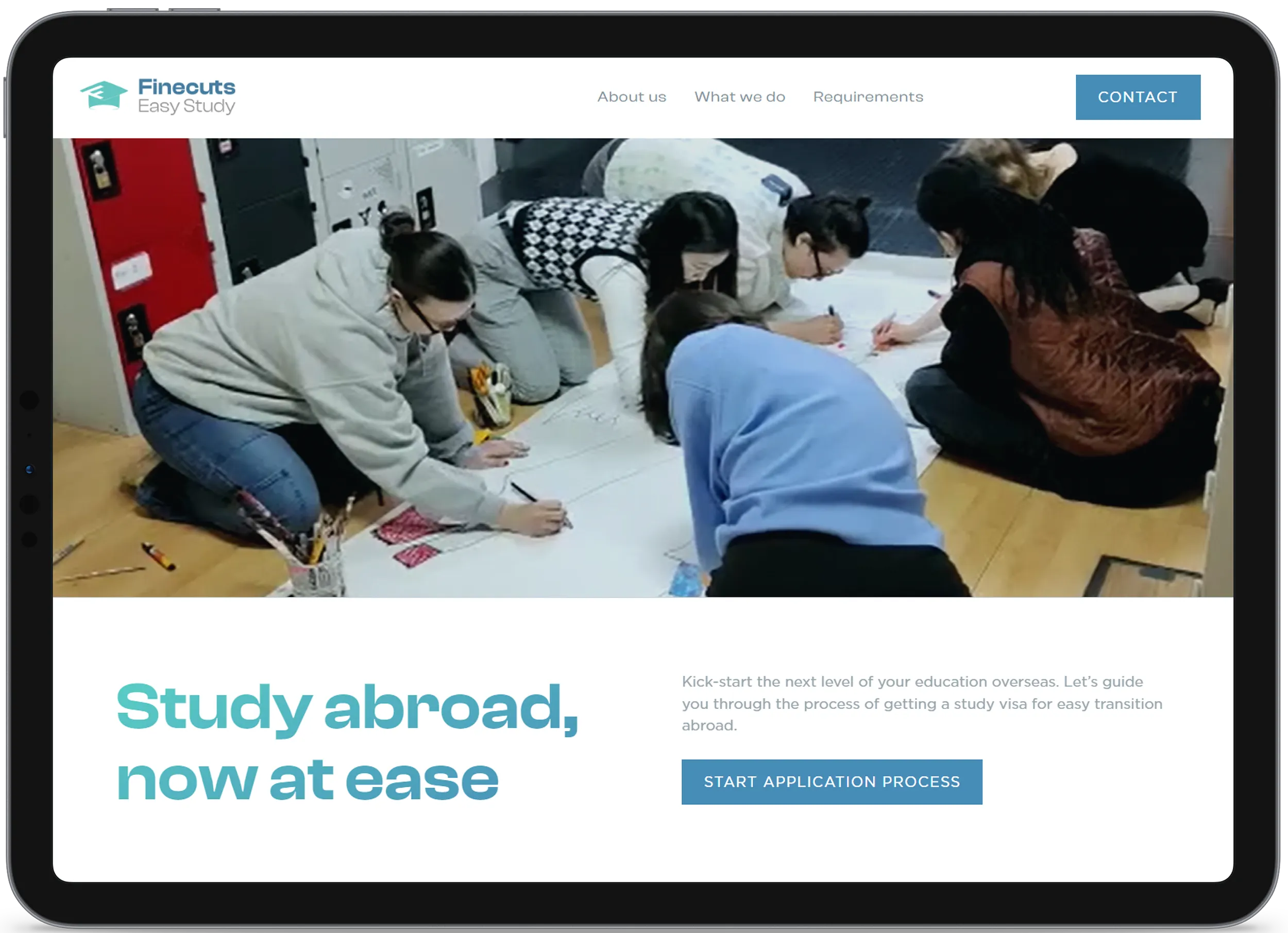
Access to quality education in Africa is limited, especially at higher level. Most institutions that offer top-notch education are expensive private schools, hence potential students prefer to invest equivalent tuition or less to seek better academic opportunities abroad. Finecuts partners with reputable colleges to assist students that desire to explore their potentials overseas. We were contacted to design and build an actionable landing page linked to an application portal.
View live site

Business goal
To make quality education easily accessible for international students that desire better opportunities abroad. Finecuts Easy Study will process applications, study visas and make accommodation arrangement at affordable fee.
The problem
There are multiple education consulting agencies out there. The sector has become so crowded that a new agency has to offer more in terms of service quality to stand out and build trust. When we were contacted, the agency had no brand assets, content nor direction as regards website's look and feel.
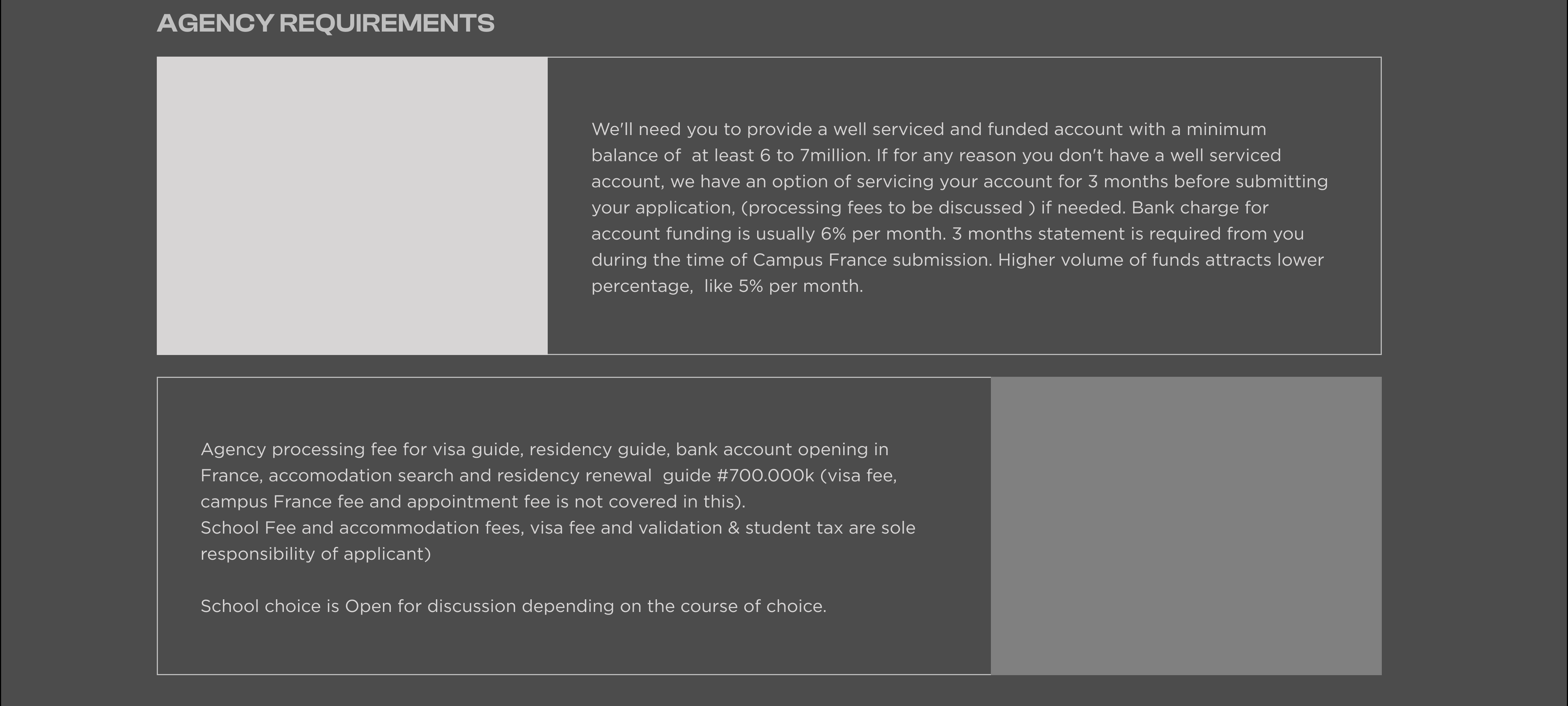
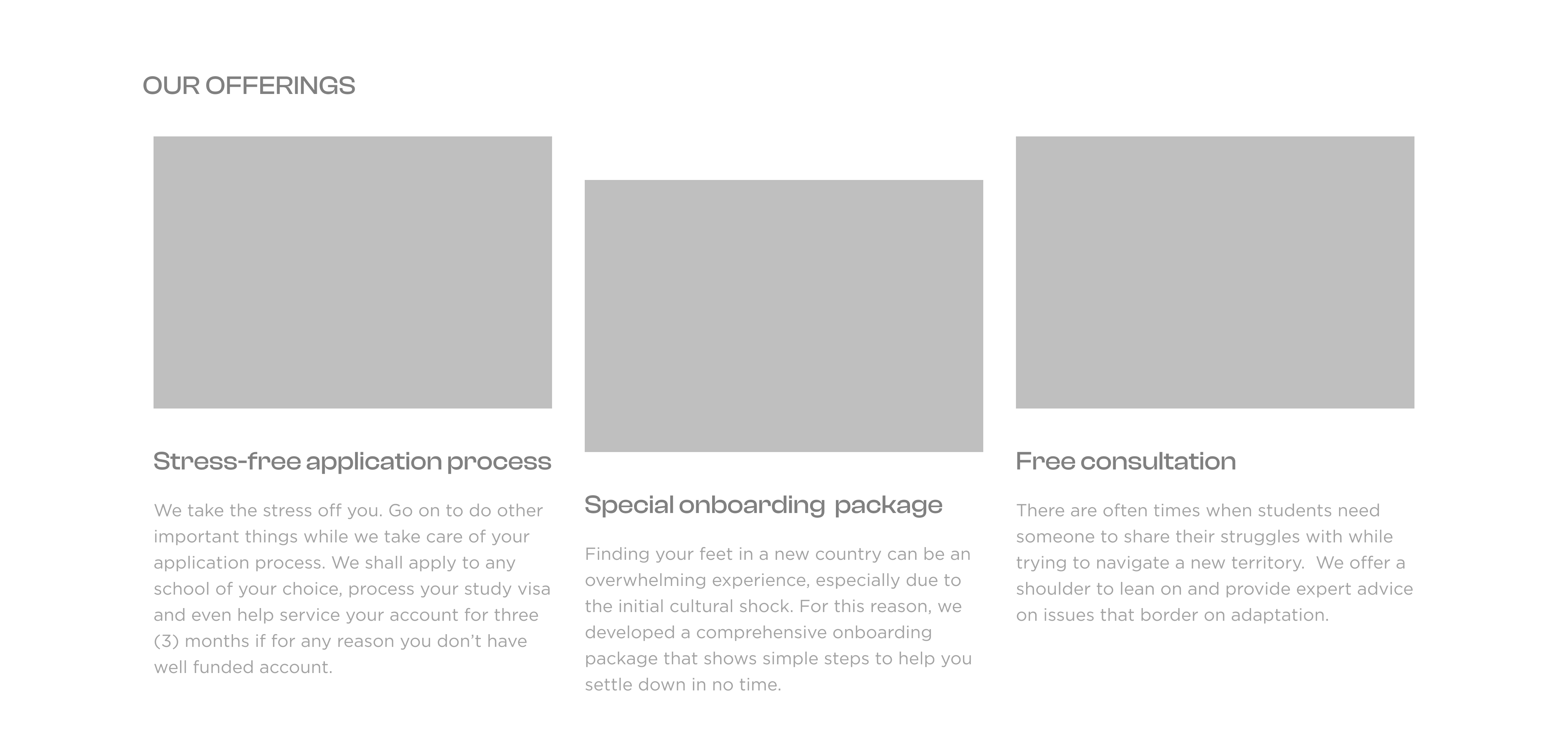
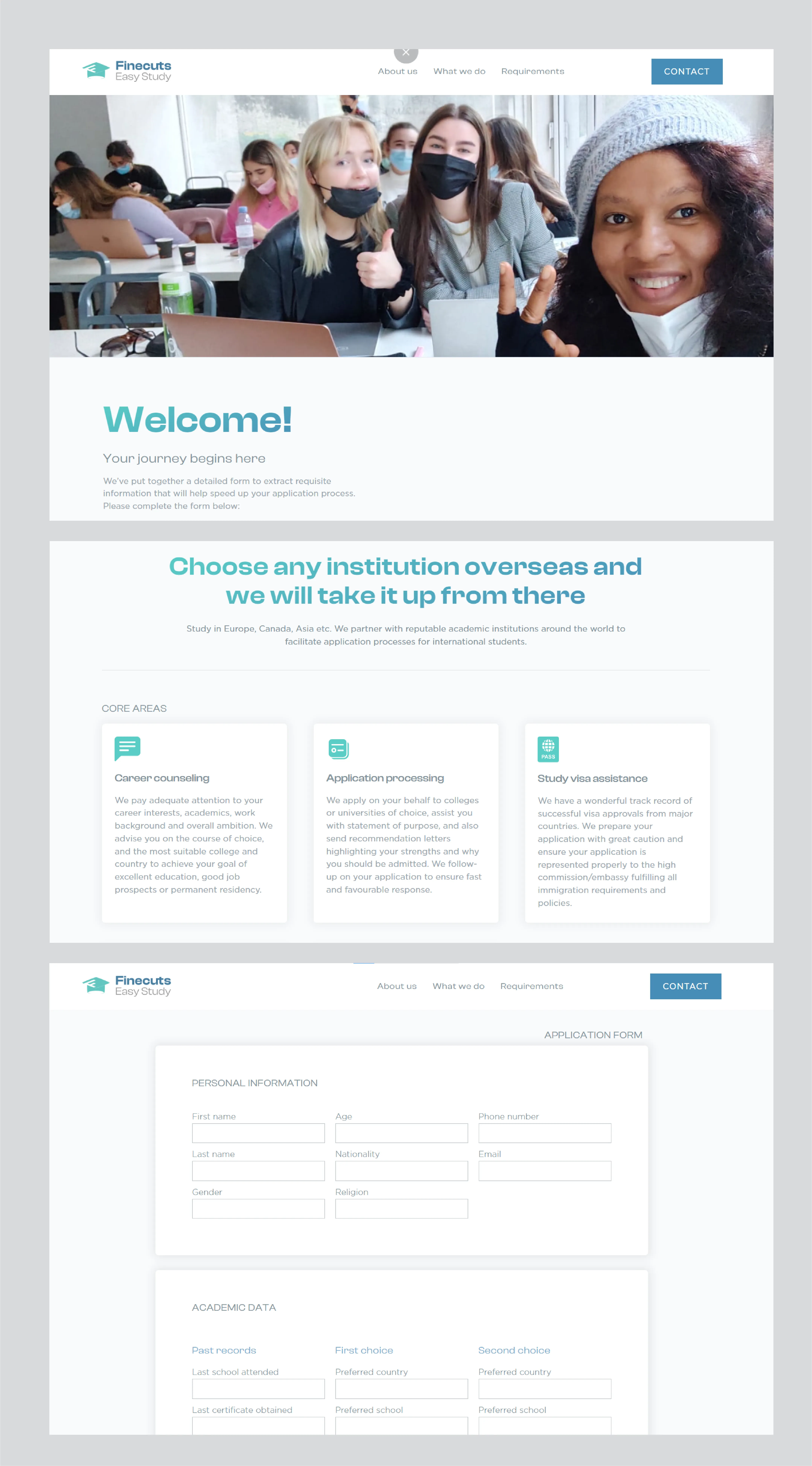
We took up the challenge to design a professional landing page. This page shows in detail the agency offerings and also highlights necessary steps for students' registration.
We took up the challenge to design a professional landing page. This page shows in detail the agency offerings and also highlights necessary steps for students' registration.
Solution
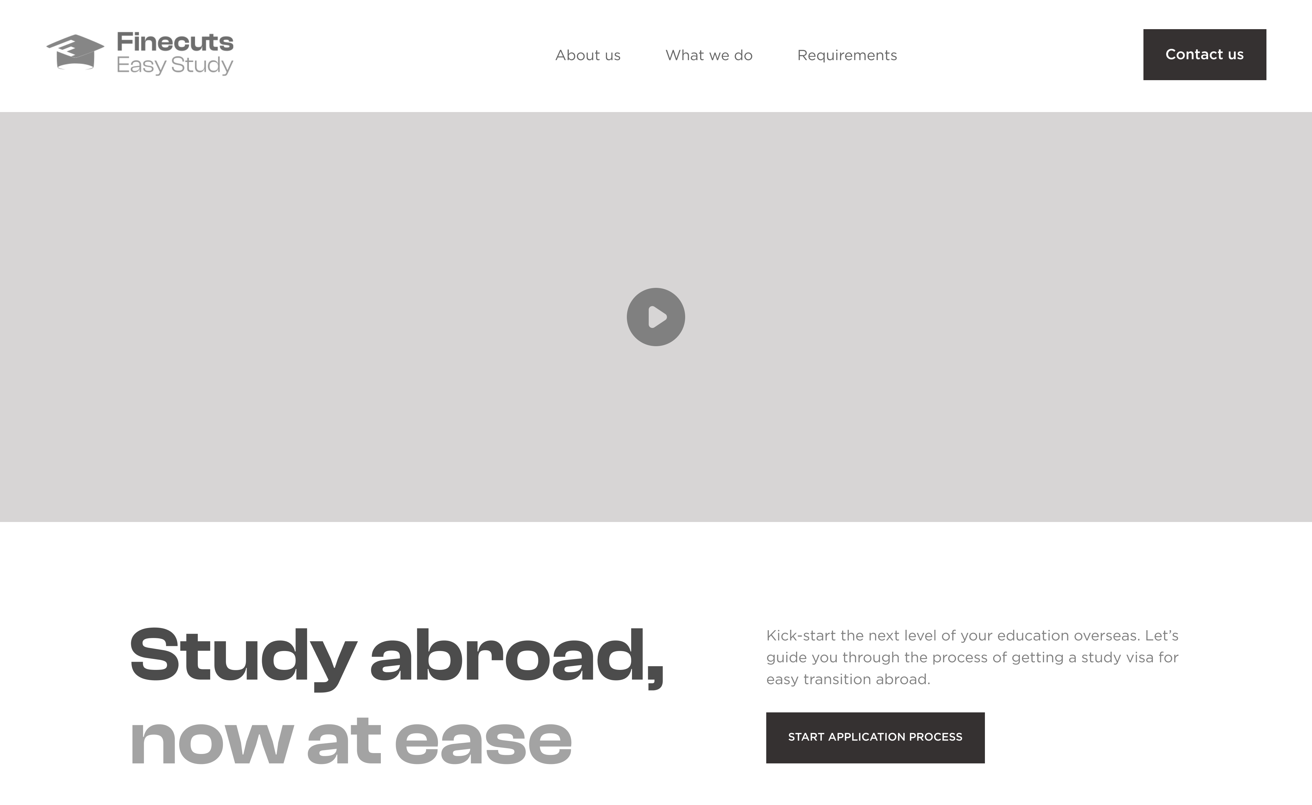
We kicked off the project with a logo design for the agency. A style guide was created to show appropriate use of logo, choice of brand colours, typeface and other design elements. Afterwards, we jumped straight into web design by developing a mid-fidelity wireframes which was shared with the client for reviews.
After a few iterations, we settled for a distinct, friendly look and feel that appeals mostly to young people. We provided precise and easily digestible content that could help earn the trust of potential students. And since it is a two page site, a few intra-page links were created to improve user experience and make vital information more accessible.
After a few iterations, we settled for a distinct, friendly look and feel that appeals mostly to young people. We provided precise and easily digestible content that could help earn the trust of potential students. And since it is a two page site, a few intra-page links were created to improve user experience and make vital information more accessible.
Result
At the end, we designed and built a simple, actionable website that helps facilitate students' application process into reputable academic institutions overseas.
"I have experienced satisfaction in every service rendered. Early and timely delivery. Your jobs are quite creative and innovative. When I contract a job to you, I just go and sleep. No unnecessary drama. You are the best! I would recommend Stupeed Studio anytime."

